Joomla 3.9.18 + Virtuemart 3.8.2 + SP Builder 3.7.2 > Documentation
Backend Editor
There are all information about virtuemart here Support Documentation SP Page Builder (Pro) 3.x
Introduction
There are some of the cool stuff in SP Page Builder that holds the power and among them, backend editor is one. The backend editor of SP Page Builder is so much powerful that you can create a websites whole structuralization with it.
The backend Editor Works like a backbone where you create your page layouts with generated addons and arranging them in a way you want. Backend editor poses amazing ease of accesses like add new row, Page creation and edit, Built-in page templates, addon listing, access to frontend editor, preview options and many more exciting stuff.
Open Backend Editor
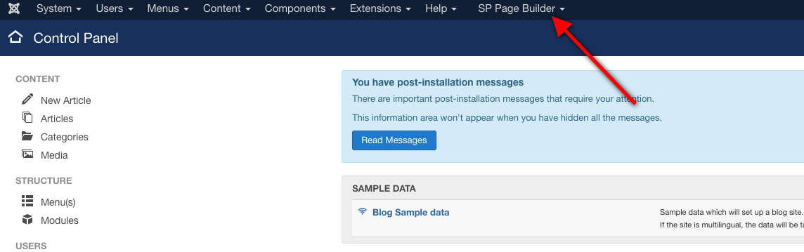
You can easily get access to the backend editor of SP Page Builder. In the Joomla menu option, you will find “SP Page Builder”. Click on top of it.
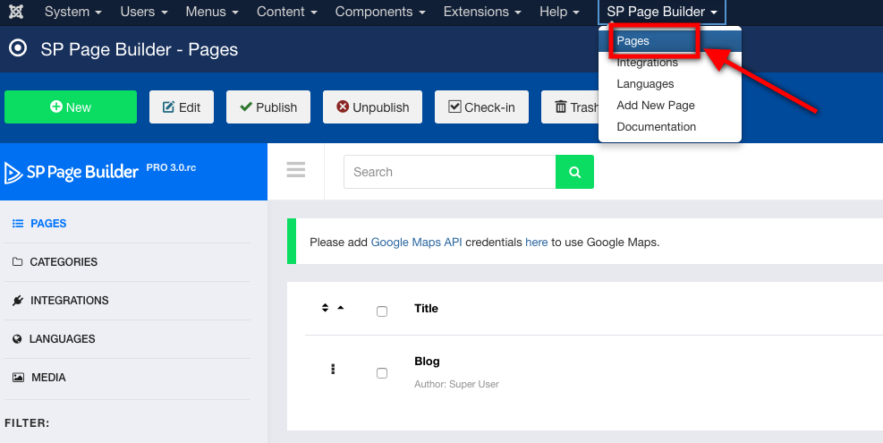
After clicking a drop-down menu will open. Here you have to click the pages option to open the backend editor of SP Page Builder.
After that, the dashboard will open.
Backend Dashboard Details
The backend dashboard of SP Page Builder 3 has lots of exciting control features that will help you to have all the assist while developing your site. Now let's explore what is there on the dashboard of SP Page Builder 3 Backend editor.
Menubar
Menubar on the top of SP Page Builder 3 allows some of the crucial easy access. Let’s take a look at them.

New: With this option, you will be allowed to create a new page for your website.
Edit: You can edit any of your pages using this option but first you have to select the page you want to edit first.
Publish: You can publish the page on the website using this option.
Unpublish: You can unpublish the page on the website using this option.
Trash: You can delete any page using this option.
Sidebar
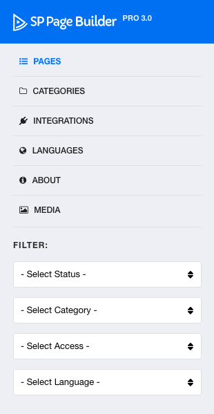
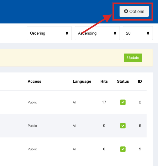
Pages: With this option, you will see the pages you have created. The list of the pages will appear with this option.
Categories: This option will allow you to see the categories you have created and used over the time of developments.
Integrations: In the integration page you will see the Joomla plugins and extensions that are integrated with the SP Page Builder. You can disable and enable the plugin from this page.
Languages: In the language page you can see the languages available in the page builder. You can install or uninstall your desired language from this page.
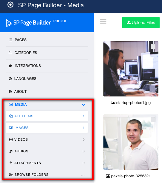
Media: The media page is very crucial in SP Page Builder. You can see the media file that you have used on the various pages. You can do all the media related modifications on this page. The media submenu also allows you to access the various types of media files you have added.
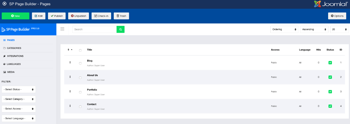
Pages
You can see your created pages here like this in the below picture: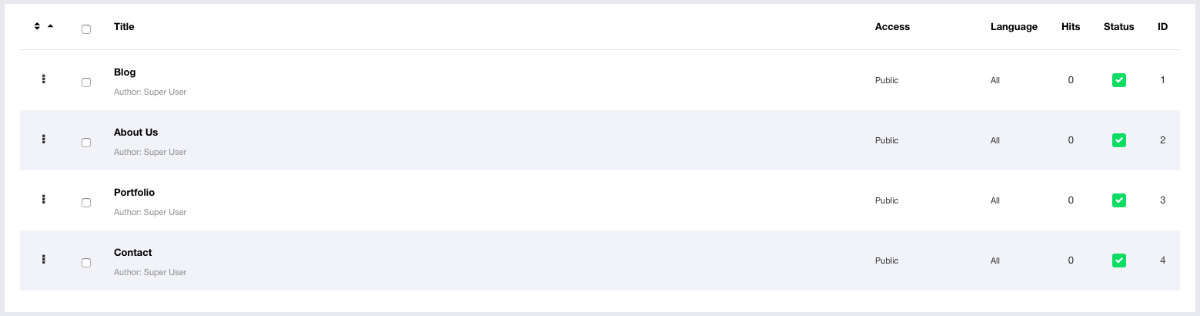
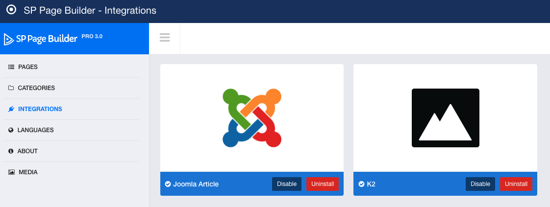
Integrations
There are some of the extensions that are integrated with SP Page Builder to make them compatible with the SP Page Builder. You can disable or uninstall anytime with "Disable" and "Uninstall" button that come along with every plugin.
- First click "Install" on selected integration box (Articles or K2)
- Then click "Enable"
- Now you can use it
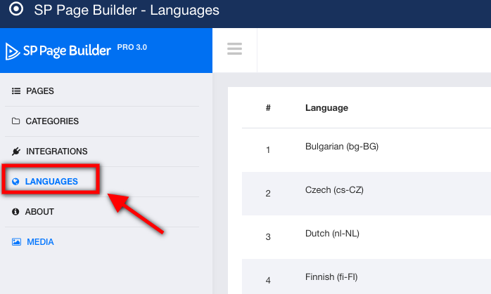
Languages
There are lots of and the most used languages come with SP Page Builder. Upon clicking the language option in the sidebar you can get access to the languages available in the SP Page Builder.
How to install languages?
In the right side of every language, there is an option named " Install". Upon clicking it you can install any language in your SP Page Builder.

Media Manager
The SP Page Builder media manager is so much power that you can manage and control your media files with ease.
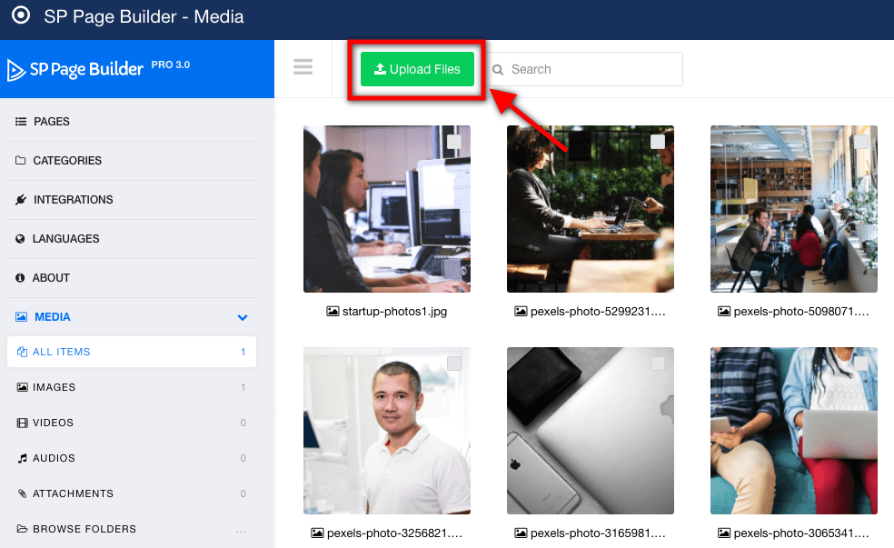
Upload Media Files
You can upload images to the media manager by clicking the upload button. This will take you to your file manager from where you have to select which media file you want to upload.
Media File Listing
You must have to upload different types of media files for the sake of your website. But all the files are listed and sorted so that you can easily get access to them.
Create a new page
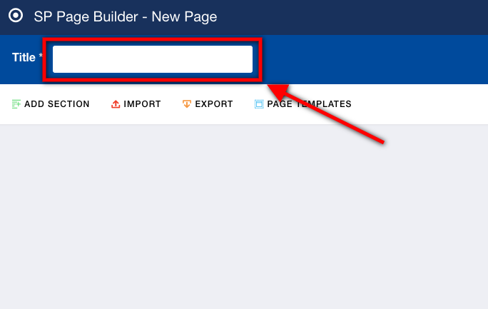
To add a new page with SP Page Builder first open the page builder. On the menu bar of the page builder click the button "New".

After that, a new page creating page will open. Here you will find three option "Add New Row", "Import" and "Page Templates"
But give you page a title.
Add New Row: With this option, you directly go on to the layout building of your page by adding the first row.
Import: If you already have a page layout developed and have the exported file. You can import the layout file using this option.
Page Templates: There are lots of in-house page templates are there which you can use to quickly setup the layout of your page.

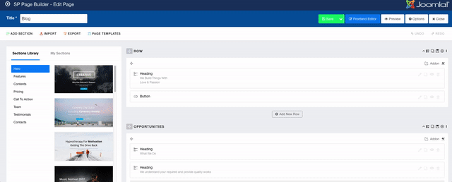
Edit Page
First, select the page you want to edit. To select click on the white box beside the page you want to edit. Then click the Edit button on the menu bar of SP Page Builder. After the layout edit of that page will open. You can also click on the page title to open the page for edit.

Add Built-in sections
To add the built-in sections open the page you want to edit. Now click "Add Section" from the top left corner of the menubar.

To add the section, just hover over the section and drag that to your layout.
Default Options
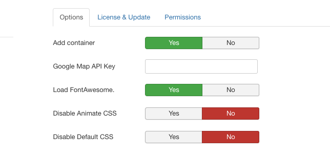
In the menu bar of SP Page Builder, you will find the Options button. With this, you do some crucial information update and core customization
In the options page, you can do the following settings,
Add container: Set the option to yes if you want to add the container to your web pages.
Google Map API key: You have to add the google map API key here. Otherwise, google map won't work and error will show up.
Load FontAwesome: Set the option to yes or no as per your desire and requirement.
Disable Animate CSS: If you want to disable your animate CSS, enable this option.
Disable Default CSS: If you want to disable your Default CSS, enable this option.
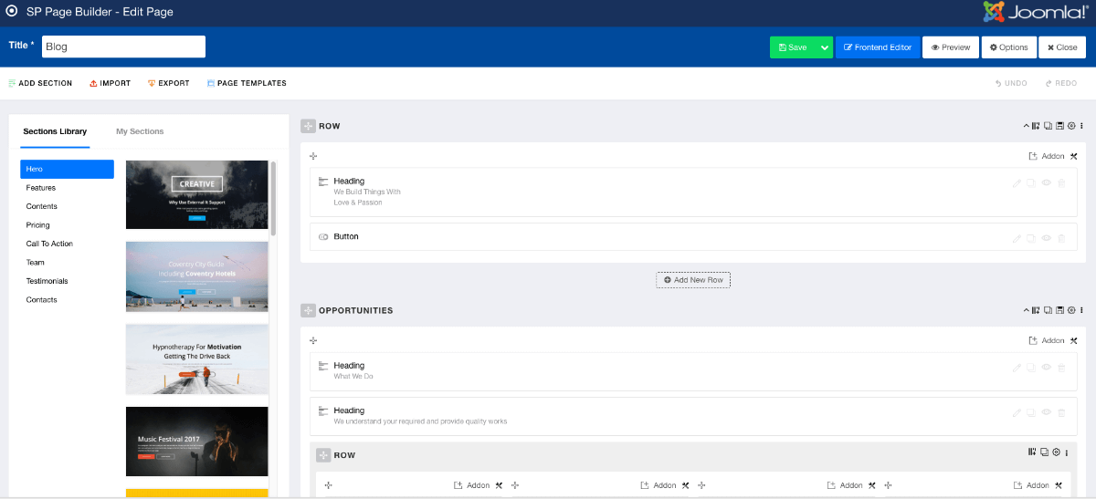
Page Layout Building-Adding Row, Column, and Addon
The building layout is one of the quickest of processes in the SP Page Builder functionalities. There are several amazing options with which you can easily construct your web pages layout. The layout building in SP Page Builder backend editor works with three things "Row", "Column" and "Addon". You have to add the row first and then define the column structure. The next job is to add the addon as per the design requirements. Now we are going to see the whole process in brief.
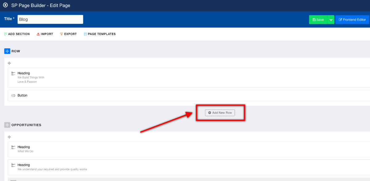
Add new row
At the bottom of every row, you can find the Add New Row button, add your first row. To add the row click on the "Add new row" button.
Add/Manage Column

Upon clicking the add new row button column structure menu will open. Here you have to add or select your desired column structure. SP Page Builder column structure works as like as the bootstrap grid. The full view is divided into twelve grids. You have to select or write down your column structure according to the bootstrap grid. For example, you want three columns in your row. In that case, we have to divide our screen into three parts. So according to bootstrap, our screen has twelve grids. So if we divide that into three columns than every column gets four grids. Then we have to select or write down 4,4,4. That means my first column has four grids like the second and third column.
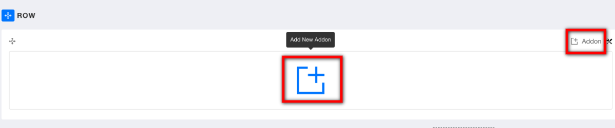
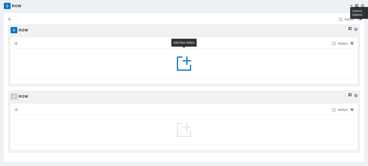
Add Addon
Now you have to add a new add on after you have defined your column structure. You can do that in two ways. There is a big plus sign in every column to add an addon in it. Also there is an addon adding button in the top right corner of every column, with it you can add your desired addon. Upon clicking the addon adding button, the list of addons will open up and you have to select and modify the addon and add it to the column.
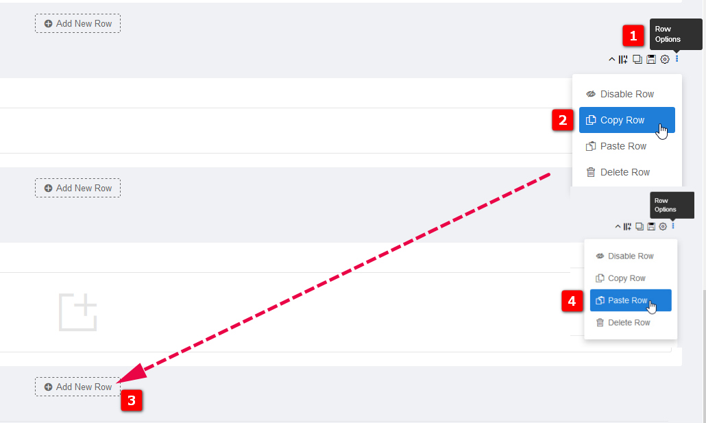
How to duplicate/clone Row
You can clone Row using 3 alternative methods:
- Use "Duplicate Row" icon
- Row Options > Copy > then Add new Row > and in new row > Row Options > Paste (screenshot below)
- Click "Save Row" > Add section > My sections > Choose saved row
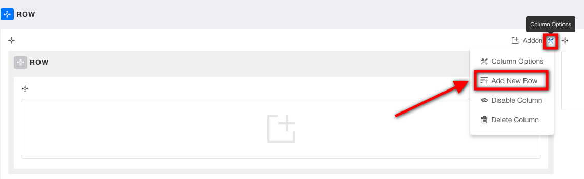
Add Nested Row
You can add nested row's that means inside one parent row, several child rows.
To add nested row click on the settings icon on the top right corner of the parent column. Remember you have to click on the settings icon on the column in which you want to the nested row. In the settings option there is an option "Add New Row". Click the option and a new will be added inside that row.
Row Options
Row options allows you to control appearance of Row:
- Admin Label - Define an admin label for easy identification. Visible only for site editor.
- Section Title - Insert a title which will be displayed as the section title. Leave blank if the section does not require any title.
- Section subtitle - Insert a subtitle which will be displayed as the section subtitle. Leave blank if the section does not require any subtitle.
- Title & Subtitle Position - set position from the list: left, center, right.
- Middle Align - Align content in middle of column.
- Fluid Row - Enable this option to make this row fluid. Fluid row will help you publish full width contents like slideshows or Google Maps frames.
- Remove Gutter - Enable this option to remove gutters between columns in this row.
- Section ID - by default is auto-created for each new Row, but you can put there custom Section ID name. Make sure it is unique. Can contain only the characters (A..Z, 1..0), plus the hyphen (-) or the underscore (_). Must contain at least one character. The value must not contain any space characters.
- CSS Class - If you wish to style a particular content element differently, then use this field to add a class name and also refer to it in your custom css file.
- Padding - set padding inside Row. Default values are 50px 0 50px 0.
- Margin - Set the margin for all four sides (Top Right Bottom Left).
- Text color - Set the default color used for fonts used inside.
- Enable background options - select No background, Solid Color, Image background or Video background.
- Enable Shape - To show shape divider at top/bottom, it's based on SVG graphic.
- Responsive - from this settings you can decide on which device you want to show or hide Row.
- Animation - basic CSS3 animation for Row.
Column Options
Column option lets you do some cool customization in your added column. You can do lots of styling with the column options.
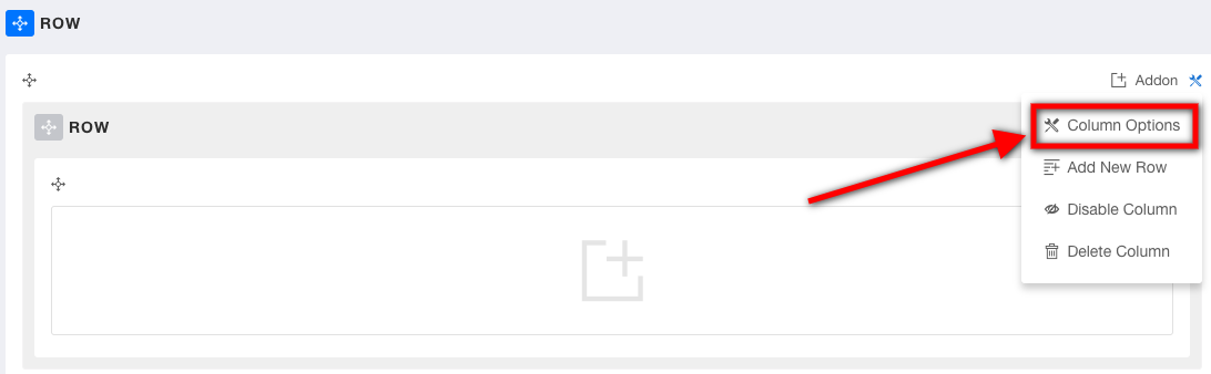
Where is the column options?
To get access to the column option click the column options icon on the top right side of every column. Select "Column Options" in the drop-down menu and the column options page will open.
Text Color
Define the text color of your added content inside the column. Use the color picker tool to add the desired color to your text.
Background Color
You can add a background color to your column. Use this option to add the desired background color. Use the color picker tool to add the required color.
Background Image
You can add a background image if you want using this option. Use the media manager of SP Page Builder to upload the background image.
Padding
Define paddings for top, right, bottom and left areas. Padding is the space between the content of the element and its border. A padding defines the space inside something. Generally, padding is expressed sequentially in Top, Right, Bottom, Left order. Negative values are not allowed.
Box Shadow
You can give box shadows to your column. For that, you have to insert the properties of box-shadow. For more details please visit the site.
CSS Class
This option will allow you to style particular elements in your added addon. Customize and style the particular content and then use this field to add the CSS class name you just used to style the content element also don’t forget to refer it to your CSS file.
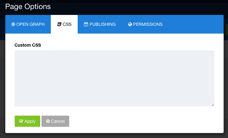
Custom CSS
You can add custom CSS to your web page. The custom CSS option in SP Page Builder lets you have a quick access towards adding necessary stylings in your web page. To add custom CSS click on the options button o the top menu of the editor. The page options page will open. Click on the CSS tab. Here you can add your custom CSS
Open Graph
Open Graph is format made by facebook. It's sort of integration between Facebook and other websites by allowing them to become rich “graph” objects with the same functionality as other Facebook objects. All of the other major platforms, LinkedIn, and Google+, recognize Open Graph tags. Twitter actually has its own meta tags for Twitter Cards which SP Page Builder Pro also support since version 3.2.x. Most content may be shared to Facebook / Twitter as a URL, so it's important that you fill Open Graph tags to take control over how your content appears on social network sites.
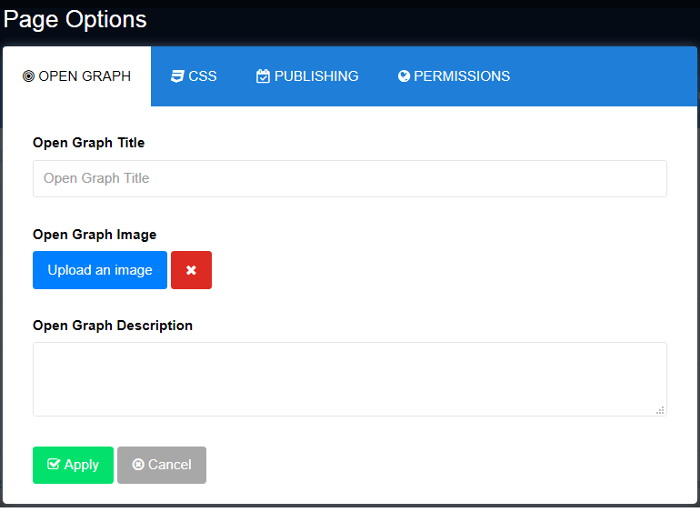
Page Options > Open Graph tab uses: Title, Image and Description field - this option adds Open Graph tags in HTML code of website.
- Open Graph Title - the title of your page without any branding such as your site name. In fact, if Facebook doesn’t find the og:title tag on your page, it uses the meta title instead. It’s best to stay between 50-90 characters.
- Open Graph Image - the image that appears when someone shares the content to Facebook. Use a rectangle image in landscape orientation, as Facebook displays them in that matter. Use images that are at least 1200 x 630 pixels (aspect ratio of 1.91:1), for the best display on high resolution devices. At the minimum, you should use images that are 600 x 315 pixels to display link page posts with larger images. Good to know that the thumbnails for shared links display at 450px by 235px. The usually supported image forms are JPG, PNG and GIF. The picture you use as an Open Graph image can be different from what you have on your page.
- Open Graph Description - a brief description of the content, usually between 2 and 4 sentences. This will displayed below the title of the post on Facebook. Unlike a regular meta description tag, it won’t affect your SEO.
Important! In order to use Facebook Insights you must add the app ID meta to your page. It can be added inside SP PB Pro Options or manually.
If you have Helix3 or Helix Ultimate In template settings, there is "Custom code" tab where you can add custom code in before </head> section. Add there extra meta:
<meta property="fb:app_id" content="1234567" />
Instead demo value "1234567" use the app ID, which you can find in your Facebook App Dashboard.
More detailed documentation with all settings, check on official website: SP Page Builder (Pro) 3.x