WoWedding - Wedding Oriented
HTML Website Template
- created: 12/28/2018
- by: Monkeysan
- themeforest.net/user/monkeysan/portfolio
Thank you for purchasing my theme. If you have any questions that are beyond the scope of this help file, please feel free to contact us via Ticksy Support System. Thanks so much!
Get Started
You have bought HTML template and we expect that you have basic HTML and CSS knowledge. If you are not expert, you can always find Basic HTML and CSS knowledge here
https://www.w3schools.com/html/
https://www.w3schools.com/css/
HTML Files
The template has 58 HTML files:
-
404_page.html
-
about_us.html
-
blog_classic.html
-
blog_masonry.html
-
blog_single.html
-
blog_timeline.html
-
coming_soon.html
-
contact_v1.html
-
contact_v2.html
-
gift.html
-
header_6.html
-
header_7.html
-
home_2.html
-
home_3.html
-
home_4.html
-
home_5.html
-
home_6.html
-
home_7.html
-
home_8.html
-
home_card.html
-
index.html
-
portfolio_classic_2.html
-
portfolio_classic_2_wide.html
-
portfolio_gallery.html
-
portfolio_grid_3.html
-
portfolio_grid_3_wide.html
-
portfolio_masonry_4.html
-
portfolio_masonry_4_wide.html
-
portfolio_pinterest_4.html
-
portfolio_pinterest_4_wide.html
-
portfolio_single_big.html
-
portfolio_single_gallery.html
-
portfolio_single_small.html
-
rsvp.html
-
services.html
-
shop_account.html
-
shop_cart.html
-
shop_checkout.html
-
shop_front.html
-
shop_single.html
-
shortcodes_accordions.html
-
shortcodes_buttons.html
-
shortcodes_call_to_action.html
-
shortcodes_counters.html
-
shortcodes_dropcaps.html
-
shortcodes_headings.html
-
shortcodes_icons.html
-
shortcodes_tables.html
-
shortcodes_tabs.html
-
shortcodes_team.html
-
shortcodes_testimonials.html
-
shortcodes_tooltips.html
-
story.html
-
team.html
Headers and Footers
Template has different headers and footers. You can find them on different Homepages.
What should you do if you want to use Header 2 from Home Page 2 on all Pages?
Open home_beach_resort.html
Search my comment
<!-- - - - - - - - - - - - - - Header - - - - - - - - - - - - - - - - --> and select code till <!-- - - - - - - - - - - - - end Header - - - - - - - - - - - - - - - -->
Copy this code

HTML Structure
<!doctype html>
<html lang="en">
<!-- Google Web Fonts
================================================== -->
<!-- Basic Page Needs
================================================== -->
<!--meta info-->
<!-- Mobile Specific Metas
================================================== -->
<!-- Vendor CSS
============================================ -->
<!-- CSS theme files
============================================ -->
</head>
<!-- - - - - - - - - - - - - - Wrapper - - - - - - - - - - - - - - - - -->
<!-- - - - - - - - - - - - - - Header - - - - - - - - - - - - - - - - -->
<!-- - - - - - - - - - - - - Mobile Menu - - - - - - - - - - - - - - -->
<!-- logo -->
<!-- - - - - - - - - - - - / Mobile Menu - - - - - - - - - - - - - -->
<!--main menu-->
<!-- - - - - - - - - - - - - - Navigation - - - - - - - - - - - - - - - - -->
<!-- - - - - - - - - - - - - end Header - - - - - - - - - - - - - - - -->
<!-- - - - - - - - - - - - - - Content - - - - - - - - - - - - - - - - -->
<!-- - - - - - - - - - - - - - Icon Box Item - - - - - - - - - - - - - - - - -->
<!-- - - - - - - - - - - - - - Icon Box Item - - - - - - - - - - - - - - - - -->
<!-- team member -->
<!-- team member -->
<!-- team member -->
<!-- team member -->
<!-- - - - - - - - - - - - - end Content - - - - - - - - - - - - - - - -->
<!-- - - - - - - - - - - - - - Footer - - - - - - - - - - - - - - - - -->
<!-- main footer -->
<!-- - - - - - - - - - - - - end Footer - - - - - - - - - - - - - - - -->
<!-- - - - - - - - - - - - end Wrapper - - - - - - - - - - - - - - -->
<!-- JS Libs & Plugins
============================================ -->
<!-- JS theme files
============================================ -->
</body>
</html>
Google Fonts
We use Google fonts
https://fonts.google.com/specimen/Hind
https://fonts.google.com/specimen/Cormorant
https://fonts.google.com/specimen/Great+Vibes
For sure you can change fonts. Select needed fonts, and copy embed code on our pages
You can see commented code
<!-- Google Web Fonts
================================================== -->
<link href="https://fonts.googleapis.com/css?family=Hind:300,400,500,600,700%7CCormorant:300,300i,400,400i,500,500i,600,600i,700,700i%7CGreat+Vibes" rel="stylesheet">
Replace our code with yours
After open css/style.css and make auto-replace
font-family: "Hind", sans-serif;
font-family: 'Great Vibes', cursive;
font-family: "Cormorant", serif;
with your font
Change Logo
Create a logo with logo.png or other logo and replace it at images folder. For better view see my logo width
CSS Files and Structure
This template uses 9 css files:
-
audioplayer.css
-
jquery.multiscroll.css
-
bootstrap-grid.min.css
-
fontello.css
-
owl.carousel.css
-
owl.theme.css
-
owl.transitions.css
-
responsive.css
-
style.css
The main style.css has such structure:
/* ----------------------------------
1. Reset default browser styles
2. Global
3. General classes
4. Typography
5. Header
6. Content Elements
7. UI Elements
7.1. Buttons
7.2. Forms
7.2.1. Inputs & Textarea
7.2.2. Label & Legend
7.2.3. Checkbox & Radio
7.2.4. Select
7.2.5. Fieldset
7.2.6. Form variations
7.3. Tables
7.4. Lists
7.5. Blockquotes
7.6. Dividers
8. Widgets & Shortcodes
8.1. Twitter Feed
8.2. Instagram Feed
8.3. LightBox
8.5. Accordions & Toggles
8.6. Alert boxes
8.7. Callouts
8.8. Pagination
8.9. Dropcaps
8.10. Icon Boxes
8.11. Testimonials
8.12. Carousel Sliders
8.13. Progress Bars
8.14. Pricing Tables
8.15. Counters
8.16. Tabs & Tour Sections
8.17. Isotope
8.18. Team Members
8.19. Google Map
8.20. Services
8.21. Countdown
8.22. Audio Player
9. Blog
9.1. Entries
10. Portfolio
11. Shop
12. Sidebar
13. Footer
-------------------------------------*/
JavaScript Files
This template includes 27 Javascript files.
-
plugins.js
-
script.js
-
jquery-2.2.4.min.js
-
jquery-ui.min.js
-
jquery.modernizr.js
-
retina.min.js
-
audioplayer.js
-
bootstrap.js
-
elevatezoom.min.js
-
instafeed.min.js
-
isotope.pkgd.min.js
-
jquery.countdown.min.js
-
jquery.easings.min.js
-
jquery.localScroll.min.js
-
jquery.multiscroll.min.js
-
jquery.queryloader2.min.js
-
jquery.scrollTo.min.js
-
mad.customselect.js
-
mad.tabs.js
-
owl.carousel.js
-
owl.carousel.min.js
-
pathformer.js
-
sticky-sidebar.js
-
vivus.js
-
jquery.fancybox.js
-
jquery.themepunch.revolution.min.js
-
jquery.tweet.js
I see error
If you open your site locally and see such error
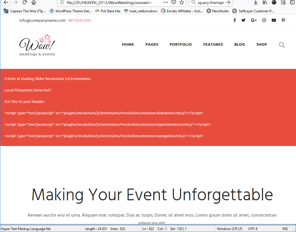
Don't worry. if you are testing on local server you need to include extensions of revolution slider (you do not need to include on live server).
Add this after revolution slider script (at the bottom of page)
<script type="text/javascript" src="plugins/revolution/js/extensions/revolution.extension.slideanims.min.js"></script>
<script type="text/javascript" src="plugins/revolution/js/extensions/revolution.extension.layeranimation.min.js"></script>
<script type="text/javascript" src="plugins/revolution/js/extensions/revolution.extension.navigation.min.js"></script>

Sliders settings
If you want to change slider settings, for example, you want switch on/off autoslideshow or change time delay you can find all slider settings here js/script.js
For carousels we use OwlCarousel. Full Documentation you can find here https://owlcarousel2.github.io/OwlCarousel2/docs/started-welcome.html
For Slider we use Revolution Slider. Full documentation is here
https://www.themepunch.com/revsliderjquery-doc/slider-revolution-jquery-5-x-documentation/
If you are looking for global slider settings open js/script.js and search
/* ---------------------------------------------------- */
/* Revolution slider */
/* ---------------------------------------------------- */
if ($('.rev-slider-wrapper').hasClass('bg-changer')) {
if ($('#rev-slider').length) {
jQuery("#rev-slider").revolution({
sliderType:"standard",
spinner: "spinner3",
shuffle:"off",
autoHeight:"off",
hideThumbsOnMobile:"off",
hideSliderAtLimit:0,
hideCaptionAtLimit:0,
hideAllCaptionAtLilmit:0,
delay:6000,
visibilityLevels:[1460,1280,1024],
responsiveLevels:[1460,1280,1024],
gridwidth:[1460,1280,1024],
gridheight:1090
});
}
delay:6000, means 6 seconds per slide. If you want 8 seconds, write 8000.
Retina
When your users load a page, retina.js checks each image on the page to see if there is a high-resolution version of that image on your server. If a high-resolution variant exists, the script will swap in that image in-place. Read more here: http://imulus.github.io/retinajs/
Preloader
if you want to remove preloader, open your HTML and remove <div id="loader" class="loader"></div>
If you want to connect Instagram to the template open js/scripts.js and search
/* ------------------------------------------------
Instagram Feed
------------------------------------------------ */
if($('#instafeed').length){
var feed = new Instafeed({
target: 'instafeed',
tagName: 'living',
limit: 6,
get: 'user',
userId: 8253949243,
accessToken: '8253949243.1677ed0.92a1c427f7274134a812ee9b13038e10',
resolution: 'standard_resolution',
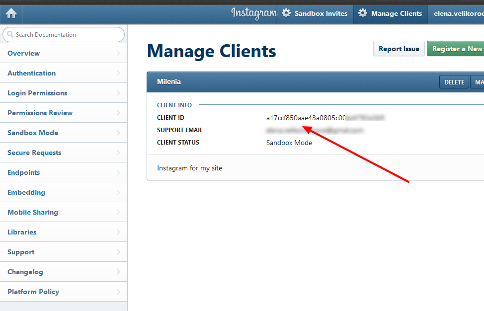
clientId: 'a17ccf850aae43a0805c00ac4792a3b9',
template: '<li class="nv-instafeed-item"><a href="#" title="{{location}}"><img src="{{image}}" /></a></li>'
});
feed.run();
}
1. You can find your userID here https://codeofaninja.com/tools/find-instagram-user-id
2. AccessToken you can generate here http://instagram.pixelunion.net/
3. clientID you can generate here https://www.instagram.com/developer/authentication/
Contact Form
To change a contact form and subscribe emails open bat/mail.php, newsletter.php and insert you email
// your email
$user_email = "mail@companyname.com";
First, create your own keys at the https://dev.twitter.com/. Create your own application and generate keys for you domain.
Second, open the \plugins\twitter\index.php file and replace the current keys with yours:
// Enter your Twitter App Consumer Key between the '' signs
private $consumer_key = 'M34vcZfmqdq3jljG2iDkw';
// Enter your Twitter App Consumer Secret between the '' signs
private $consumer_secret = 'QUtghffuLmcKLDRx30CiKpJ8TZ3419oZmsfRCXU8U';
// Enter your Twitter App Access Token between the '' signs
private $user_token = '1151103902-64LKmAgFbda9t7neziu31rq8WV7hQGZ2bAjbrh2';
// Enter your Twitter App Access Token Secret between the '' signs
private $user_secret = 'CPcpO2hYYUoBTqBIzEHQgzF9xN4i6Oly04Q3m0HBwz8p7';
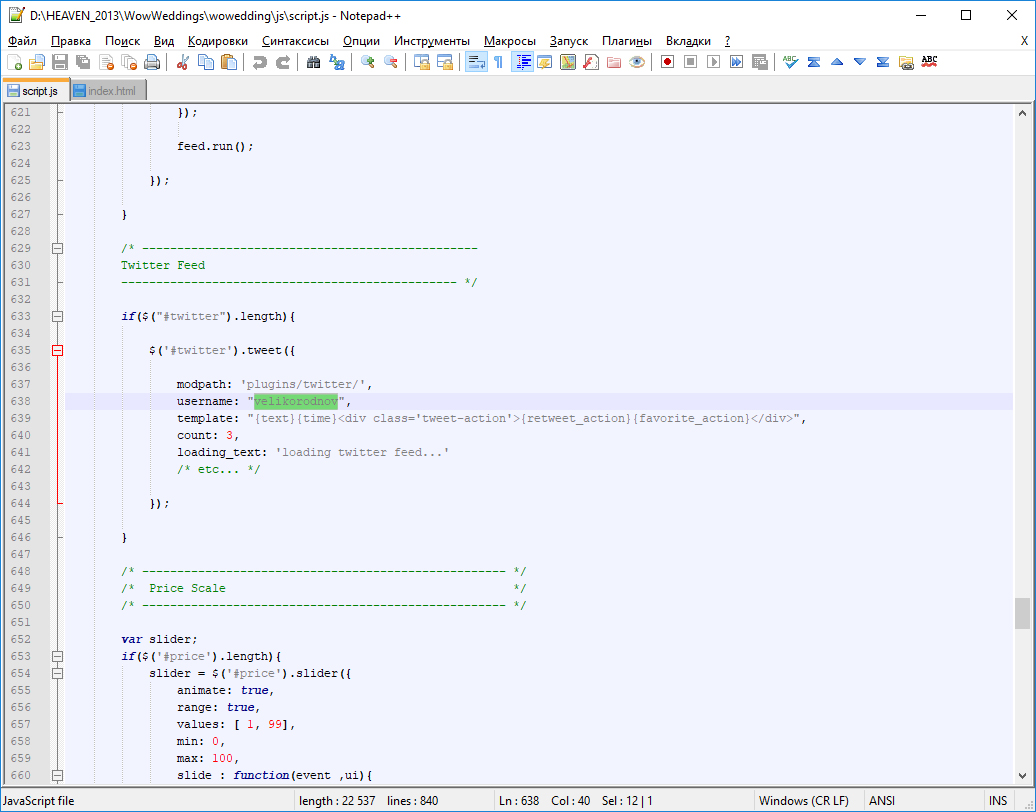
Third, open the js\script.js file, find the following code:
/* ------------------------------------------------
Twitter Feed
------------------------------------------------ */
if($("#twitter").length){
$('#twitter').tweet({
modpath: 'plugins/twitter/',
username: "velikorodnov",
template: "{text}{time}<div class='tweet-action'>{retweet_action}{favorite_action}</div>",
count: 3,
loading_text: 'loading twitter feed...'
/* etc... */
});
}
Replace velikorodnov with your twitter username.
Google map
Open js/js/scripts.js and search
/* ---------------------------------------------------- */
/* Google Maps */
/* ---------------------------------------------------- */
if ($('#googleMap').length) {
var myCenter = new google.maps.LatLng(30.2259488, -97.7145152);
function loadMap() {
var mapProp = {
center: myCenter,
zoom:13,
mapTypeId:google.maps.MapTypeId.ROADMAP
};
Change coordinates. You can generate new coordinates here
https://www.gps-coordinates.net/
Today each map should have own Map Key. You can see it at the bottom of page
<script src="https://maps.googleapis.com/maps/api/js?libraries=places&key=AIzaSyD84AvI_F-k-mne4PxTQzej89AA6-orgEg"></script>
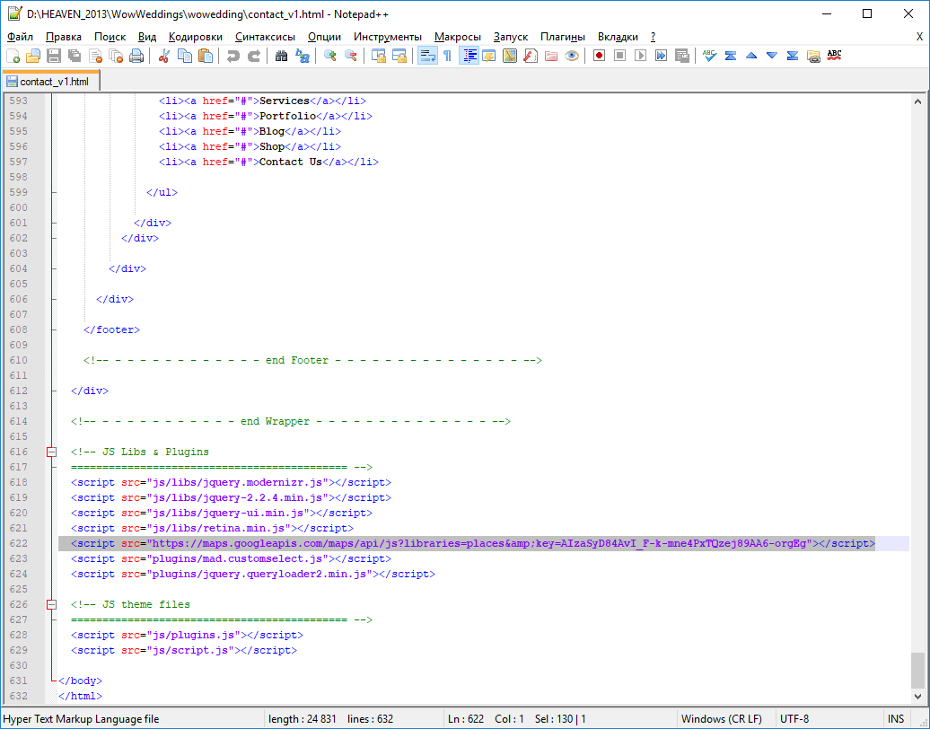
You have to create it for your domain and replace our key with yours
How to create key read here https://www.wpgmaps.com/documentation/creating-a-google-maps-api-key/
Sources and Credits
I've used the following scripts:
-
jquery.min.js - main js library
-
jquery-ui.min.js - a curated set of user interface interactions, effects, widgets, and themes built on top of the jQuery JavaScript Library
-
jquery.modernizr.js - a small piece of JavaScript code that automatically detects the availability of next-generation web technologies in your user's browsers
-
retina.min.js - an open source script that makes it easy to serve high-resolution images to devices with retina displays
-
scripts.js - custom js with plugin's settings
-
audioplayer.js - Responsive and Touch-Friendly audio player
-
owl.carousel.min.js - Touch enabled jQuery plugin that lets you create a beautiful responsive carousel slider
-
jquery.fancybox.js - a tool for displaying images, html content and multi-media in a Mac-style "lightbox" that floats overtop of web page
-
tweets.js - twitter feed plugin
-
select2.js - Select2 is a jQuery based replacement for select boxes. It supports searching, remote data sets, and infinite scrolling of results.
-
jquery.arcticmodal-0.3.min.js - jQuery plugin for modal boxes development.
-
mediaelement-and-player.js - HTML5 <audio> or <video> player with support for MP4, WebM, and MP3 as well as HLS, Dash, YouTube, Facebook, SoundCloud and others with a common HTML5 MediaElement API, enabling a consistent UI in all browsers.
-
moment.js - Parse, validate, manipulate, and display dates and times in JavaScript.
-
jquery.localScroll.min.js - Animated anchor navigation made easy with jQuery
-
jquery.queryloader2.min.js - Preload images with ease
-
pathformer.js - Turn Vivus' pathformer into a tiny CLI utility
-
vivus.js - library to make drawing animation on SVG
-
sticky-sidebar.js - Pure JavaScript tool for making smart and high performance sticky sidebar
-
jquery.themepunch.revolution.min.js - the most powerful slider